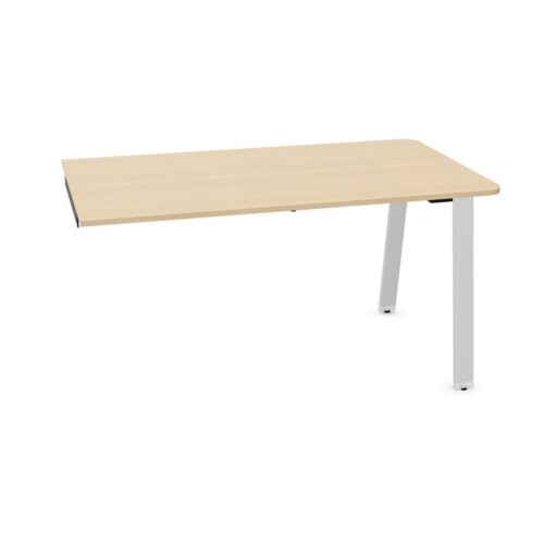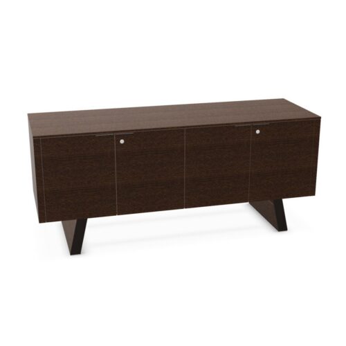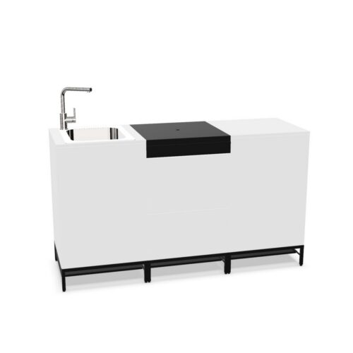


Pink office furniture can bring warmth, character and clear visual zoning to a workplace without changing the practical role of the furniture itself. On this page, pink refers to the primary visible colour of the product as a whole, rather than solely its frame, base or upholstery.
From softer blush and pastel tones to stronger rose, coral-leaning and vivid pink finishes, this selection helps workplace teams compare furniture with a pink-led appearance. As with any colour choice, it is useful to consider the surrounding interior, the intended atmosphere and how individual pieces will work together across the floorplan.
What does pink mean in office furniture?
Colour descriptions can cover a broad family of shades. A pink product may appear pale and understated, warm and muted, or more saturated and expressive depending on its material, finish and lighting. The exact tone shown in product imagery should therefore be reviewed alongside product specifications and, where appropriate, samples or swatches.
For this archive, the colour applies to the overall visual identity of the item. It does not simply indicate a pink detail on an otherwise differently coloured product. That distinction can be helpful when coordinating furniture for reception areas, collaboration spaces, meeting rooms or focused work settings.
Why use pink in a workplace scheme?
Pink can be a considered part of a professional interior palette. Lighter shades may soften more functional environments, while deeper or brighter versions can create a defined point of interest. It is often selected to add personality to shared spaces, support brand-led interiors or differentiate a particular zone from the rest of the office.
Its effect depends on scale and context. One pink item can act as an accent among neutral desks, storage and flooring; a repeated shade across several pieces can make a space feel more intentionally connected. Balance is important, particularly in larger areas where frequent visual repetition may have a stronger impact.
- Introduce an accent colour alongside white, grey, black, timber or muted finishes.
- Help distinguish informal, visitor-facing or collaborative areas from desk zones.
- Create a welcoming visual contrast in spaces with hard surfaces or restrained architectural finishes.
- Develop a colour palette that reflects an organisation’s identity or wayfinding approach.
Where can pink furniture be used?
Pink furniture can suit a range of commercial settings, provided the shade and product type are appropriate for the activity taking place. In entrance and reception areas, it may contribute to a memorable first impression. In breakout spaces, cafés and informal meeting points, a warmer palette can help the setting feel distinct from task-focused areas.
It may also be used in education, hospitality-inspired workplace environments, studios and customer-facing spaces where colour has a role in the interior concept. Within open-plan offices, a pink-led piece or group of pieces can provide a visual marker for a touchdown, waiting or collaboration zone without relying on permanent partitions.
Consider how the chosen tone will look under the site’s natural and artificial light. Colours can appear cooler, warmer, flatter or more vivid at different times of day, and finishes such as fabric, plastic, metal and laminate may reflect light differently.
Furniture types to compare by colour
Filtering by pink is a practical starting point when assembling a coordinated scheme, but colour is only one part of a procurement decision. The available products may span seating, tables, storage, accessories and other workplace furniture, depending on the current catalogue. Compare each item’s dimensions, intended use, materials and configuration options before selecting it for a project.
For example, a pink seating piece may be considered for its comfort, support and suitability for the expected duration of use, while a pink table or storage item will require attention to capacity, surface requirements and location. A matching colour does not necessarily mean that products share the same finish, texture or maintenance needs.
How to build a balanced pink colour palette
A successful scheme usually combines a dominant background colour with supporting tones and a smaller number of accents. Pink can be the accent, the supporting colour or, in more characterful interiors, a repeated feature. Start with the fixed elements that are unlikely to change, such as flooring, walls, lighting, joinery and existing desks, then assess which pink shade works with them.
- Pair pale pink with neutrals or light timber for a calm, softer contrast.
- Use a richer pink with darker finishes when a more defined visual statement is required.
- Repeat the colour selectively across a zone rather than matching every item exactly.
- Allow for variations in texture: a matte finish, woven textile and smooth moulded surface may show the same shade differently.
- Keep circulation routes, signage and functional distinctions clear when using colour for zoning.
It can also be useful to consider longevity. A more muted pink may sit comfortably within a changing office environment, while a stronger shade may be most effective in elements that can be repositioned or refreshed as the layout evolves.
Questions to consider when choosing pink office furniture
Colour and finish
Check whether the product is available in the precise shade required and whether all visible components are pink. Product photography is a useful guide, but it should not be treated as a substitute for confirming the finish where colour matching is important.
Use and location
Think about who will use the item, how often it will be used and where it will sit. A visitor area, meeting setting and individual workstation can each have different requirements for comfort, durability, privacy, storage or cable access.
Layout and coordination
Review dimensions, clearances and neighbouring furniture as part of the wider plan. The office space planning guide can help frame decisions around circulation, zones and the relationship between furniture and available floor area.
Planning colour alongside practical requirements
Procurement works best when appearance is assessed alongside operational needs. Build a schedule that records the product, quantity, dimensions, finish, location and any relevant options for each item. This makes it easier to identify where a consistent pink tone is important and where related colours or materials will produce a more practical result.
For larger projects, consider reviewing the full palette at the same time as the furniture plan. Guidance on choosing office furniture can support comparisons between different product types, workplace activities and layout priorities.
Explore related Myntwork furniture ranges
Pink is one way to narrow a broad furniture search, whether it is being used as a subtle complement or a prominent part of an interior scheme. Continue browsing the wider office furniture collection to compare categories, finishes and solutions for workspaces, meeting areas, reception settings and shared spaces.