


Gold office furniture is a broad color category rather than a promise that every product uses metal or a metallic finish. The range includes cabinets, acoustic pieces, accessories and other furniture, where gold may appear in fabric, a surface finish or a small detail. Identify the actual colored component before building a scheme around it. A gold-toned panel and a gold-toned cabinet can play different roles in the same room. In a workplace with both focused and social zones, the color could be concentrated at the shared meeting point rather than repeated at every desk. This helps the accent communicate a location. If gold appears on movable screens, note where they will stand when a room is reconfigured. The visual scheme should remain legible after furniture moves.
Choose the scale of the accent
A small gold detail on an accessory has a different visual effect from a full cabinet front or upholstered divider. Decide whether the color should mark a reception point, identify a shared area or repeat quietly across the floor. Try the larger pieces on a plan before choosing many smaller accents. Their combined area can be more prominent than a sample board suggests.
Gold office furniture can be used sparingly where users naturally gather or move. A screen near a meeting area may be more visible than one behind a workstation. Consider what the color looks like from the entrance and from occupied seats. Let the furniture’s practical position determine whether it becomes a feature.
Plan acoustic elements for their task
Acoustic desk screens, dividers and ceiling pieces appear in the range. Their place should follow noise sources, sight lines and the need for separation. A colored screen should not be chosen solely as decoration. Check its height and installation, and review performance information for the selected product if it is expected to affect sound.
Gold office furniture in acoustic categories may use fabric in a warm gold tone, while adjacent cabinets use a different material. Compare them under the room’s lighting. The colors may work together without matching exactly, but the difference should look deliberate. Keep routes around freestanding pieces clear.
Make storage usable
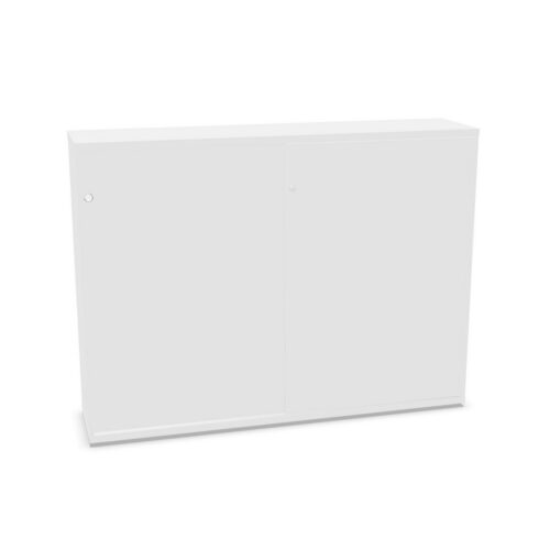
Cabinets should be placed near the contents and people they serve. A gold finish on a storage front can make the unit visually prominent, so check whether that emphasis helps users find a shared resource or overwhelms a small room. Leave clearance for doors and drawers. Tall units may also alter daylight and views across the space.
Gold office furniture in cabinet categories can include different constructions and finish sheens. Do not infer a metal surface from the color name. Look at material and care information for the specific unit. A frequently touched storage front needs a realistic cleaning plan as well as a suitable visual tone.
Use accessories with restraint
Small accessories can echo a cabinet or panel without repeating its full visual weight. They should still have a defined purpose, such as cable organization or support for daily tools. Check attachment points and access for maintenance. A decorative color relationship is not enough if the accessory interferes with the user’s work surface.
Gold office furniture accessories may sit beside power fittings or darker desk equipment. Compare their finish under task lighting. A warm tone can shift in appearance between daylight and artificial light, and gloss may create reflections. Test the selected pieces together in the actual room.
Review the whole arrangement
Place colored pieces on a floor plan with people, doors and equipment shown. Check circulation and the view from each main activity zone. A gold-toned divider may mark a boundary, while a cabinet can provide a visual anchor, but both must remain practical. If several materials carry the same label, keep a record of the actual finish selections.
Gold office furniture can give a workspace a distinct thread of color across useful components. Start with the role of each piece, compare the real surfaces and refine the amount of gold visible in the room. The result should support orientation and daily use rather than depend on color alone.




Alea


