


Purple office furniture appears across acoustic screens, wall panels, dividers, cabinets and smaller accessories. A purple fabric panel and a purple storage front have different textures and uses, even when both carry the same color label. Begin with the room’s work patterns: where people need focus, where they talk and where materials are stored. Then identify which product component carries the purple finish and how visible it will be.
Decide where separation helps
A desk screen may define one user’s work position. A larger floor divider can create a quieter corner within an open plan. Purple on either surface can make the boundary noticeable, but the height and placement should follow the task. Check views between colleagues and leave clear paths around freestanding pieces. The screen should not block light or a display used by the group.
Purple office furniture in acoustic categories includes more than one construction. Review the selected product’s performance data if sound control is part of the brief. A visual divider may help people understand zones without solving every noise problem. The room’s ceiling, walls and seating layout remain relevant.
Use wall panels as part of the room plan
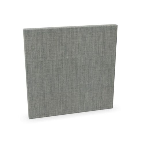
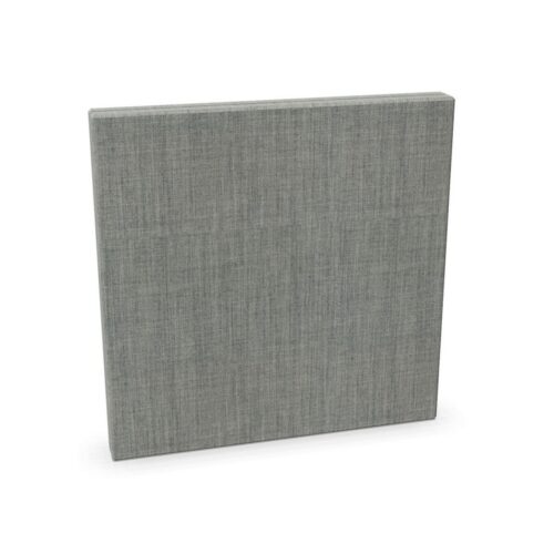
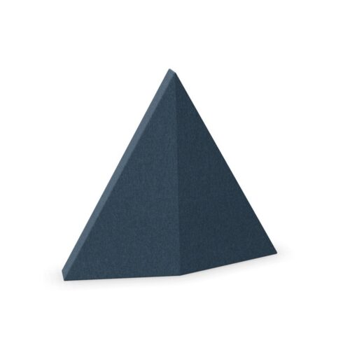
Wall-mounted upholstered acoustic panels can put color on a vertical surface without taking floor space. Place them where people speak and listen, and where cabinets or displays will not cover them. Consider their visual effect from the entrance and from the seats they are meant to serve. Confirm mounting requirements before treating a panel as an easy finishing touch.
Purple office furniture at wall and desk level may not have identical fabric or hue. Compare physical samples in the room’s light. A small sample can understate how much color a panel introduces at full scale. If several panels are planned, sketch their total area and spacing rather than choosing each one separately.
Keep cabinets accessible
A purple cabinet may identify shared supplies or provide a distinct background in a social area. Its location should follow the contents and users. Leave enough space for doors and drawers to open fully. A tall storage unit can affect daylight and views, while a low unit may preserve openness but occupy more wall length.
Purple office furniture in cabinet categories may use laminate, painted metal or other surfaces. The color name does not establish the material. Check the finish and care instructions for the selected unit. Fabric panels and hard cabinet fronts may be intended to relate visually without matching exactly.
Consider seating by posture
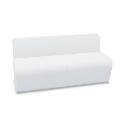
Some general purple color products may be chairs or lounge elements. Check whether purple is on upholstery, shell or frame. A lounge chair should support conversation with nearby seats and a reachable surface. A meeting chair must fit its table and allow participants to enter or leave easily. Use the color to connect areas only after the seat serves its activity.
Purple office furniture can make a social zone more recognizable within a larger floor. Avoid scattering isolated colored seats where they do not support a group. Arrange pieces around real conversations and clear circulation. If a divider helps define the zone, test the view from inside and outside it.
Balance finish and function
Purple can read warm or cool depending on light and neighboring materials. Compare fabrics and hard finishes beside flooring, walls and desks under the room’s actual lighting. Decide whether the color should be a repeated thread or concentrated in one area. Record selected finishes for future additions.
Purple office furniture is most useful when color clarifies the workplace rather than distracting from it. Position acoustic pieces for appropriate boundaries, storage for access and seating for the intended posture. Review the complete layout with people and equipment in place. Then adjust the visible balance of purple surfaces. If the work area changes, decide which screens can move and which wall or cabinet elements remain fixed. That distinction helps the color scheme adapt without creating a collection of unrelated accents.


Boss Design




Boss Design


