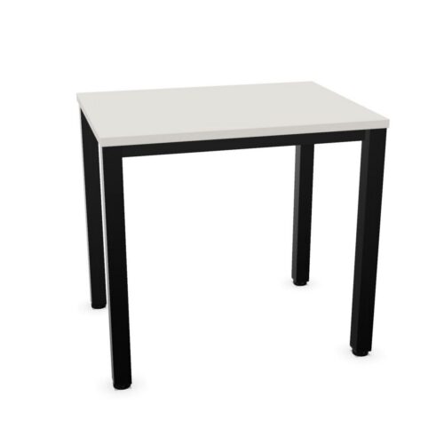


Pink surface office furniture brings a considered colour accent to workplace settings while keeping the supporting structure, frame and base separate from the finish being filtered here. On this page, pink refers to the visible work surface or outer furniture surface, such as a desktop, tabletop or cabinet face; it does not describe the colour of the legs, underframe or other supporting components.
For procurement teams, designers and facilities managers, a pink surface can help identify zones, support a defined interior palette or introduce warmth into shared spaces. The exact shade, material and extent of the coloured surface vary by product, so individual product details remain important when comparing suitable items.
What does pink surface colour mean?
Surface colour describes the finish seen on the principal usable or outward-facing part of a furniture item. Depending on the product, this may be a desk top, meeting table top, reception counter surface, storage front, display panel or another visible outer section.
A product listed with a pink surface may still have a black, white, metallic, timber-effect or differently coloured base. This distinction is useful where a workplace scheme calls for a particular top or front finish while the frame needs to coordinate with existing furniture, flooring or fittings.
Why choose a pink work surface or furniture finish?
Pink can be used with restraint as an accent within a broader office colour plan, or as a more visible element in customer-facing and collaborative areas. It can soften interiors dominated by neutral finishes and provide an easy visual marker for particular activities, teams or zones.
- Creating a recognisable colour cue in reception, breakout or project areas.
- Supporting brand-led or hospitality-inspired workplace interiors where pink forms part of the wider palette.
- Adding contrast against neutral walls, flooring and frame finishes.
- Helping differentiate informal touchdown points, shared tables or storage locations from general workstations.
- Coordinating selected furniture surfaces with existing decorative elements without requiring every component to be pink.
Colour should be considered alongside the practical demands of the setting. A surface that looks appropriate in a visual scheme also needs to suit its intended use, cleaning routine, expected wear and the scale of the space.
Where pink surface furniture can work well
Pink-finished surfaces are often most effective where colour has a clear role rather than being applied indiscriminately. In a reception area, a coloured counter or occasional table can contribute to a welcoming first impression. In collaboration spaces, pink table surfaces or storage fronts can distinguish an informal area from rows of standard desks.
They may also suit creative studios, education-adjacent environments, cafés within workplaces, wellbeing rooms and social spaces. Within open-plan offices, a limited number of pink surfaces can help define neighbourhoods or shared-use settings, particularly when combined with compatible seating, lighting and acoustic elements.
For more formal settings, using pink on smaller or secondary surfaces may provide a balanced approach. Consider sightlines from entrances, meeting rooms and adjacent work areas, as colour can read differently across a large floorplate than it does in a sample or product image.
Furniture types to compare
The products available under this filter may include different furniture categories, and the pink element will not be the same on every item. Review the description and imagery to establish exactly which visible surface carries the finish.
- Desks and worktables: the pink finish may apply to the desktop or table top, while legs and frames are specified separately.
- Meeting and collaborative tables: a coloured top can make a shared area more distinct within an open office or breakout space.
- Storage furniture: pink may appear on cabinet faces, doors or outward-facing panels rather than on the carcass or handles.
- Reception and occasional furniture: visible outer surfaces can contribute to a coordinated visitor or hospitality area.
Where consistency matters across several items, compare product images, dimensions and finish information rather than assuming that products with the same surface-colour label use an identical shade or material.
How to choose the right pink finish
Start with the role of the furniture and the amount of colour needed in the room. A larger desk or meeting-table surface will have more visual impact than a cabinet front or occasional table, so the same pink can feel quite different according to its area and position.
Next, assess the surrounding finishes. Frame colour is especially relevant because it is not defined by this filter. A pink desktop paired with a dark frame can create a more graphic contrast, while a lighter or neutral base may give the furniture a quieter appearance. Also consider wall colours, carpet, task seating and nearby joinery so that the surface supports the wider specification.
Questions to consider before specifying
- Which component is pink: the desktop, top, cabinet face or another visible outer surface?
- How much of the room will the surface occupy, and will it be seen from key approaches?
- What base or frame colour is required to work with the existing furniture?
- Is the item intended for focused work, meetings, storage, reception or informal use?
- Will several products need to coordinate, and should their finishes be checked together?
- Does the selected size provide the required working area, circulation space and access?
Planning colour within an office layout
Surface colour works most successfully when it is considered as part of the overall layout rather than as an isolated product decision. Repeating a pink finish at selected points can provide continuity between a reception space, breakout area and collaboration zone. Equally, reserving it for one location can make that setting easier to recognise without overwhelming the interior.
Allow for natural and artificial lighting, as both can affect how a colour is perceived. Samples, product imagery and neighbouring finishes should be reviewed in context wherever possible. For guidance on balancing furniture, circulation and workplace zones, see the office space planning guide.
Specifying furniture for practical use
Although surface colour is an important visual filter, it is only one part of a procurement decision. Check dimensions, configuration, material information, cable-management requirements where relevant, storage capacity and compatibility with other furniture. For desks and tables, ensure that the chosen top size supports the intended number of users and the equipment used there.
It is also helpful to consider how furniture will be maintained in daily use. The product specification should guide decisions about suitable cleaning and use, particularly in busy shared areas. Broader considerations for comparing options are covered in our guide to choosing office furniture.
Related Myntwork furniture ranges
Pink surface finishes can be part of a wider workplace scheme that includes workstations, meeting furniture, storage, reception pieces and breakout settings. Browse the office furniture collection to compare categories and identify products that suit the functional and visual requirements of your project.
- Reset all
- Yellow