

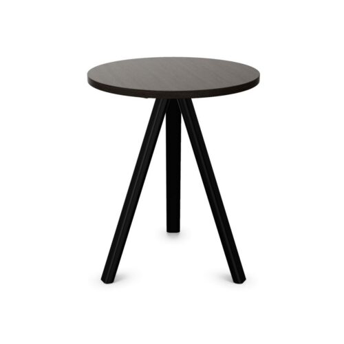
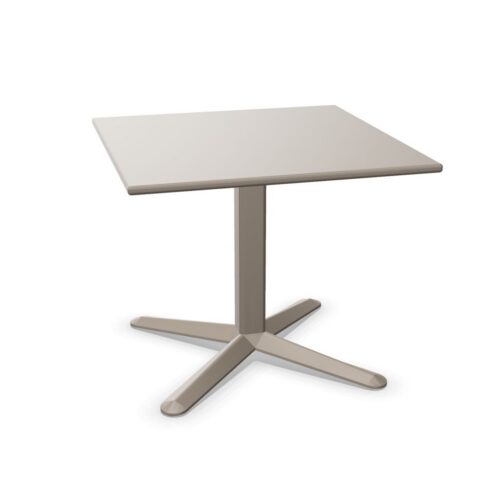
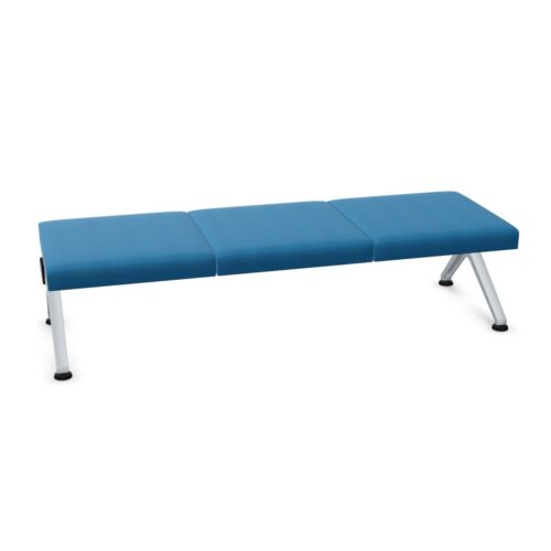
Lounge Furniture With Blue Bases and Silver Bases

lounge furniture with blue bases and silver bases brings blue and silver into the same base specification for a workplace lounge. Establish how those attributes appear on the actual furniture before deciding how to coordinate the setting. The terms alone do not explain their distribution, the base construction or its surface character. A clear visual reference is therefore central to a useful comparison.

Begin with the room’s main arrival view. Consider whether the base is meant to introduce color, connect nearby furniture or remain a secondary detail below the seating. Blue and silver should be assessed together against the proposed floor and background. Do not assume that silver establishes a particular underlying material or level of reflection. The aim is to understand the visible combination and give it a deliberate place within a reception lounge, shared waiting area or informal conversation setting.

3 models
From €16.85 p/m
7 models
From €5.17 p/m
9 models
From €7.11 p/m
28 models
From €27.43 p/m
79 models
From €31.57 p/m

Establish What the Combination Looks Like

Review complete furniture views before selecting surrounding colors. Identify where blue and silver appear and which parts of the base are visible from normal approaches. Do not assume that the two terms describe separate components or a particular arrangement. The actual furniture should establish that relationship.

Use closer views to clarify details that remain uncertain. If the surface character is important to the interior concept, confirm it directly. Silver does not, on its own, establish an underlying material or a specific appearance under light. Those details need to be assessed for the furniture itself.

Coordinate Lounge Furniture With Blue Bases and Silver Bases

Set a hierarchy for the room's colors. Decide whether blue should attract attention beneath the seating or repeat a color already present elsewhere. Then assess how the silver aspect participates in that composition. The result should be judged against the floor and the broader room, rather than through isolated color references alone.

Nearby furniture does not need to duplicate every base detail. A shared visual relationship may be enough, provided it is intentional. Compare actual surfaces where an exact match matters, especially when elements will be viewed directly beside one another.

Review Lighting From Normal Viewing Positions

For lounge furniture with blue bases and silver bases, lighting should be part of the visual review. Observe the actual surfaces under conditions relevant to the intended room. Check the approach from reception, the view from adjacent seating and any direction exposed to changing daylight. This reveals how the combination appears in context without assuming a particular reflective quality.

Consider the background behind the furniture as well as the floor beneath it. A base may be easy to distinguish from one direction and less apparent from another. Decide which views deserve the strongest visual emphasis.

Keep Placement Connected to the Lounge's Purpose

Assess lounge furniture with blue bases and silver bases within the intended furniture group. For a waiting area, keep the relationship to reception clear. For a conversation setting, organize seating around the people using it and preserve an understandable route around the group. Color coordination should support that arrangement rather than determine it alone.

Once the layout is established, check whether neighboring furniture conceals important base details or creates overlapping outlines. Record any remaining questions about construction and care separately. A visually coherent combination still requires its practical details to be confirmed for the intended setting.

Frequently Asked Questions

Does silver identify the underlying base material?

The term alone does not provide enough detail to establish the underlying construction. Confirm that separately if it matters to the project. Assess the visible silver aspect through the actual furniture rather than assuming a specific material.

Should the blue and silver relationship be checked in person?

A direct comparison can help where their exact appearance is central to the room concept. At minimum, use clear references that show both attributes together and confirm any surface details that remain uncertain.

Can nearby furniture use a different silver appearance?

It can, if the difference supports the intended composition. Compare the elements together from normal viewing positions. An exact match is a separate design requirement and should be stated explicitly whenever it is necessary.

Explore related selections