

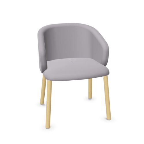
Lounge Furniture With Red Bases and Silver Bases

lounge furniture with red bases and silver bases calls for a considered review of color placement at the base of the seating. Red and silver provide the defining visual references, but the complete furniture needs to be assessed to establish how those references appear together. Do not assume a particular distribution of color or a specific construction. Start with the visible details and their relationship to the room.

In a reception lounge, the most useful comparison is between the entrance view and the view from nearby seats. Red may draw attention differently depending on its surroundings, while the appearance of silver needs to be judged under the actual lighting. Consider the floor, the seating above the base, and adjacent interior elements as a single composition. This keeps the focus on a coherent red and silver relationship rather than isolated color preferences.

3 models
From €16.85 p/m
5 models
From €10.11 p/m
7 models
From €5.17 p/m
9 models
From €7.11 p/m
3 models
From €18.94 p/m

Balancing lounge furniture with red bases and silver bases

Establish where red and silver are visible on the furniture before developing the surrounding palette. Their placement affects the overall composition, so the first step is observation. Review the complete piece and note the areas that face the entrance, nearby seats, and the main circulation route through the lounge.

Use those views to decide how the combination should relate to the room. It may connect with existing accents or introduce a distinct pairing within the seating area. Keep the intention clear enough that the proposed arrangement can be judged against it, rather than relying on a general preference for either color.

Compare silver through its actual appearance

With lounge furniture with red bases and silver bases, silver should be assessed as a visible reference without inferring a particular underlying material. Its exact surface appearance also needs confirmation. Compare what is actually visible under the intended lighting, especially where the base sits against the floor or another background color.

If silver appears elsewhere in the interior, view those elements together. A shared color description does not establish an identical finish or visual match. Decide whether the design needs close coordination or a broader relationship, then use the actual appearances to assess whether that requirement is met.

Give red a deliberate place in the composition

Review how the red relates to the seating above the base and to the room's strongest existing accents. Avoid adding surrounding red elements simply to repeat the name of the color. A repetition should have a clear purpose within the room, such as connecting separate seating groups visually.

Consider the balance from across the reception as well as from close range. The red and silver details may have different prominence depending on viewpoint and lighting. Judge the complete furniture group under the conditions that matter to the project, and record any color relationships that need further confirmation.

Organize the lounge around clear relationships

Arrange lounge furniture with red bases and silver bases so that the seating positions make sense before fine details are finalized. Establish which seats form a group, how people approach them, and where circulation passes nearby. Then assess whether the color pairing remains coherent throughout those views.

Prepare a comparison brief that separates observed appearance from unanswered specification questions. Include visible color placement, relationships to nearby finishes, and the proposed seating orientation. Confirm material or care details independently when needed. This allows the red and silver concept to be discussed precisely without turning a color description into an unsupported construction claim.

Frequently Asked Questions

Does silver identify a specific underlying material?

No specific underlying material should be inferred from the silver reference alone. Confirm composition separately if it matters to the project, and judge the visible silver appearance directly within the room.

Should other silver details look identical?

That depends on the intended scheme. Compare the actual appearances together and decide whether close matching is necessary or whether a broader color relationship provides sufficient coordination.

How can the red and silver balance be assessed?

View the complete seating group from the entrance and from within the lounge. Compare the visible placement of each color against the floor, seating surfaces, and surrounding accents before finalizing the palette.

Explore related selections