







Give blue office cabinets a clear visual role
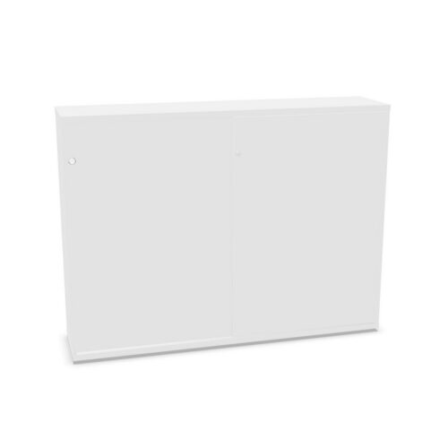
Blue can sit alongside other cool tones, repeat an established accent or provide contrast against a more neutral palette. Before choosing, decide which relationship you want. Review the cabinet’s imagery beside the actual materials in the room; a colour name alone cannot show how the finish will appear under different lighting or next to nearby furniture. This is especially useful when the cabinet is visible from several work areas.
If the office has multiple storage points, consider whether blue should connect them or distinguish only one location. Repeating the finish can give a room a consistent reference, while selective use may help make a particular resource area easier to recognise. Keep the intended approach in a project note and compare all candidates against it. This makes discussions clearer and helps prevent colour decisions from drifting as furnishings are added.
Fit storage to the people who use it
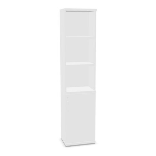
Start with what belongs inside. A cabinet used for team supplies may call for a different organisation plan from one holding documents or an individual’s work materials. Identify the users and how often they need access, then compare those needs with the specific interior arrangement described for each product. Review the opening method as part of that assessment, since it affects how people interact with the cabinet in its planned location.
For shared use, agree how items will be grouped and returned. A clear arrangement makes it easier for colleagues to use the storage without having to ask where things belong. Think about who will maintain the system and whether the cabinet should serve one group or several. These decisions give the furniture a defined purpose and keep the blue finish in context as one part of a broader workplace plan.
