

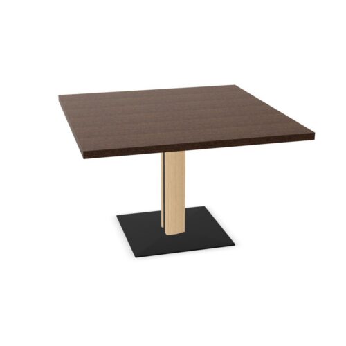
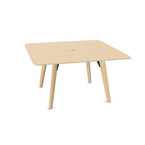
Red Square Conference Tables for Group Discussion

Conference tables with square tops and red surfaces pair a regular meeting shape with a color that deserves deliberate placement. The square top defines the working area, while the red surface can become a prominent part of the room depending on its shade and surroundings. Assess the combination alongside the presentation wall, chairs and floor. This helps establish whether the table should carry the main color emphasis or connect with red details already present.

The practical arrangement begins with how meetings unfold. Colleagues reviewing papers around the tabletop need access to shared material, while presentation sessions need useful views toward a display. Red square conference tables should be positioned with both activities in mind. Check where people enter, which corners sit near walking routes and how chairs move during use. A clear layout allows the chosen color and geometry to form part of a room that supports ordinary working routines.

11 models
From €21.26 p/m
2 models
From €30.93 p/m
€42.11 p/m
2 models
From €2.13 p/m
2 models
From €13.06 p/m
13 models
From €8.10 p/m
6 models
From €5.43 p/m
11 models
From €11.32 p/m
2 models
From €227.52 p/m
2 models
From €15.29 p/m
3 models
From €9.12 p/m
€5.33 p/m

Balance the Table With Presentation Backgrounds

Look at the table and presentation area in the same view. If the room includes colored walls, posters or other prominent elements, decide how the red surface relates to them. The aim is a clear visual arrangement in which meeting content remains easy to locate. A square top provides a definite outline, so repeating red throughout the room may be unnecessary. Compare the actual shade with surrounding colors under meeting lighting. Also assess the view from the chair positions facing the display, since this is where the tabletop and presentation background are most likely to be seen together.

Place Conference Tables With Square Tops and Red Surfaces

Mark out the expected working positions before settling the table orientation. The square shape can support discussion around its edges, but it does not remove the need to check presentation views or chair access. Follow the path from the door to the positions people are likely to use. Corners near the entrance deserve particular attention, especially when someone arrives after others are seated. Consider whether the table should align with the room or with the presentation area. Base that choice on the resulting movements and sightlines, with the red surface evaluated within the completed arrangement.

Keep Color Separate From Meeting Information

Red appears in many kinds of working material, including annotations, diagrams and physical samples. Check how those items look against the tabletop before relying on their color to communicate meaning. A red note or marker may need a clear backing or a different placement when the surface is similar. Shared information should remain understandable through labels, position and content as well as hue. Use the square working area to organize materials by purpose, keeping active discussion documents accessible and separating them from items that are only being held for later reference during the meeting.

Review the Room During Everyday Use

Assess conference tables with square tops and red surfaces with chairs pulled out, papers in place and the door in normal use. This reveals relationships that an empty-room view can hide. The red area visible between documents may differ from the uninterrupted surface seen before a meeting starts. Chair backs may also change how clearly the square outline reads from the entrance. Check that people can stand, turn and reach the presentation area without creating awkward crossings. Then consider whether surrounding red accents still contribute to the room or simply repeat a color already clearly established by the tabletop.

Frequently Asked Questions

Does red require a neutral room around it?

No single surrounding color scheme is required. Conference tables with square tops and red surfaces should be compared with the actual walls, chairs and floor. Decide which elements should be prominent, then check that the combination leaves the presentation area and working materials visually clear.

How can red annotations remain easy to identify?

Compare typical annotated documents with the tabletop during planning. The paper itself may already provide a clear boundary, while loose red samples may need more separation. Use written labels and deliberate placement so that the information remains understandable without depending entirely on differences in color.

Is the doorway the best reference for positioning?

It is an important starting point, especially for circulation, but it is not the only reference. Consider the presentation wall and working positions as well. Trace how someone enters, joins the discussion and leaves a chair, checking the square corners along each part of that route.

Explore related selections