



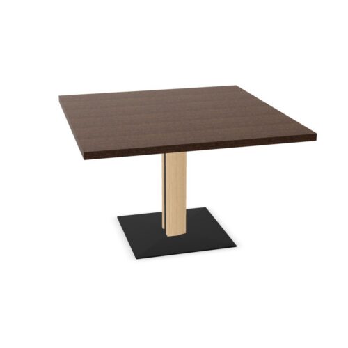


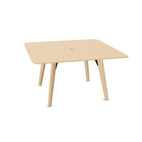

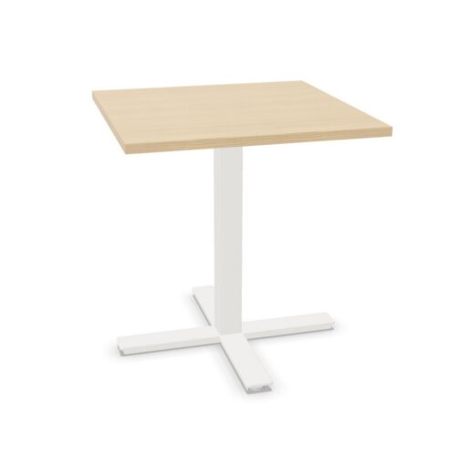


Establish Contrast Around the Table
Before arranging the furniture, compare the beige tabletop with the largest neighboring color areas. These may be the floor, a wall or the chair upholstery. An almost matching combination can look different under the room's actual lighting, so view the materials together from both seated and standing positions. Decide where you want a visible boundary around the table. Contrasting chairs may provide that boundary, or the floor may already distinguish the square outline clearly. There is no need to introduce contrast everywhere; concentrate on the relationships that help people recognize the table and its surrounding routes.
Position Conference Tables With Square Tops and Beige Surfaces
Use the doorway and the main presentation surface as reference points when testing the table position. A square arrangement can look orderly when its edges follow the room, but the best placement also leaves a straightforward approach to chairs. Check the corners nearest the entrance and any storage that colleagues access during meetings. If the table is angled, examine the resulting paths rather than relying on the visual effect alone. Beige can sit quietly among other neutral colors, making it especially useful to judge the physical layout through actual chair positions and walking routes.
Make Papers and Personal Work Easy to Locate
Consider how meeting materials appear against the beige background. White papers, pale notebooks and light accessories may have less obvious boundaries against some beige shades than against others. Compare the actual combination before deciding how to organize the working surface. With conference tables with square tops and beige surfaces, a designated central area can help separate shared documents from individual notes. Keep frequently used papers oriented toward the people reading them, and leave personal writing areas identifiable. The square shape provides a clear framework, but the meeting routine should determine where materials are placed.
