



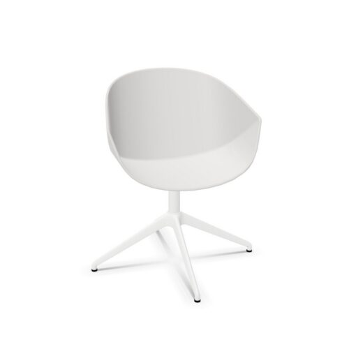


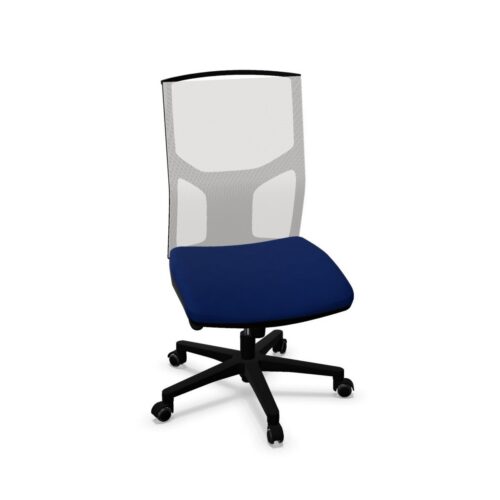


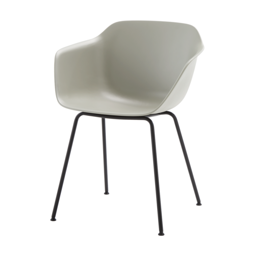
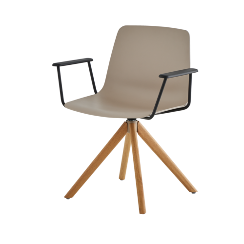




Read The Base Against The Whole Room
Begin with the surfaces nearest the chair. A gold base may be seen against a pale floor, a dark carpet or the legs of a shared desk, and each setting changes its visual emphasis. Examine those relationships from normal viewing positions, including the entrance to the room and the seated positions around neighbouring desks.
Consider repetition before deciding where the colour belongs. Repeating gold at every workstation creates a different composition from reserving it for one enclosed room. Neither approach establishes suitability on its own. The useful question is whether the base supports the intended hierarchy of the space without requiring unrelated furnishings to be replaced simply to make the chair fit visually.
Keep Colour Separate From Construction
A gold appearance does not tell you what supports the seat or how the surface was finished. Ask for the actual base material and the relevant care instructions when comparing candidates. Avoid treating a photograph, colour description or familiar visual effect as evidence of construction, durability or a particular method of manufacture.
Make a short distinction in the seating brief between required appearance and required performance information. The former can specify a gold base; the latter should record the details needed for the intended use. This makes comparisons clearer when two chairs share a similar colour but differ in dimensions, controls or documented maintenance requirements relevant to the workplace.
