


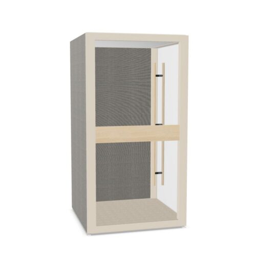
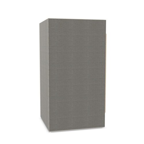
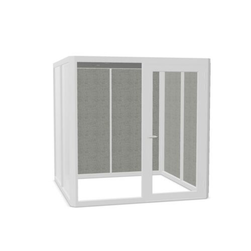


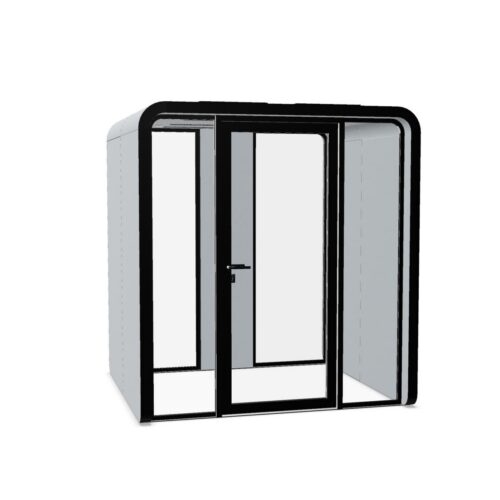
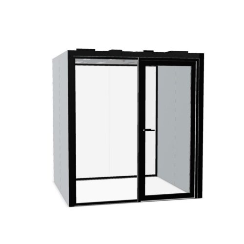


Read the undertones of beige office pods
Beige covers a useful range of visual effects, from pale cream to deeper sand and grayish neutrals. Identify whether the proposed shade leans yellow, pink or gray before comparing it with the office. Two finishes described as beige can appear unrelated when placed beside each other.
Review a representative finish sample in the intended location, if available. Look at it during daylight and under the lighting normally used later in the day. A shade that appears balanced near a window may look warmer deeper inside the office. Judge that change against the surrounding palette, rather than expecting beige to appear identical everywhere.
Build contrast into a pale palette
A neutral enclosure still needs a readable outline. Against cream walls and light flooring, consider how the entrance and corners will remain apparent to people approaching from different directions. Existing darker joinery or a contrasting wall behind the pod can provide definition without adding a new accent color.
Avoid trying to match every pale surface exactly. Slightly different creams can make an intended match look accidental. Instead, establish a clear relationship: a warmer enclosure against a cooler background, for example, or beige alongside a distinctly darker floor. Assess any visible frames and interior finishes separately, because their colors may vary by model.
