

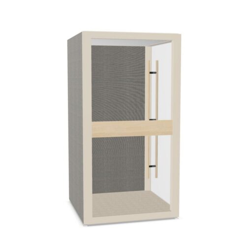
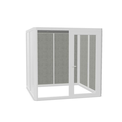
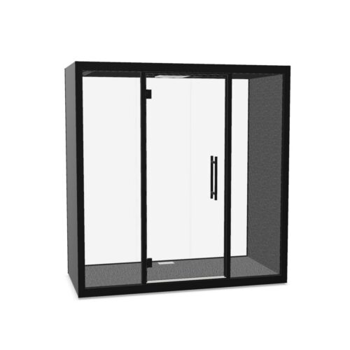
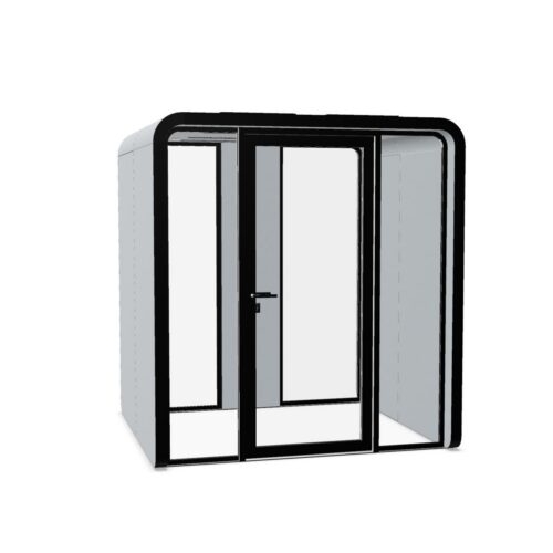
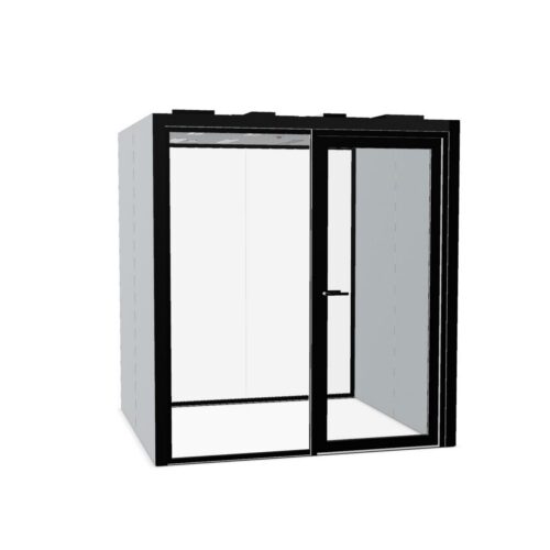
Grey Office Pods for Balanced Shared Spaces

Grey office pods may suit workplaces bringing an enclosed work setting into an interior with several existing colors and finishes. A neutral exterior can provide a visual connection between those elements, although the effect depends on its tonal depth and undertone. Pale grey, medium shades and charcoal-like colors each create a different relationship with walls, flooring and neighboring work areas.

Begin with the views that matter most: the route past shared desks, the approach to the entrance and any sightline from a client-facing space. A grey enclosure should have a clear place within that layout, whether it blends with surrounding architecture or creates a distinct boundary. Compare the shade under normal office lighting, then review individual models for the intended activities and practical requirements. A balanced palette helps the enclosure belong in the room; access, operation and documented characteristics determine its suitability for work.

5 models
From €301.44 p/m
3 models
From €355.68 p/m
2 models
From €122.72 p/m
3 models
From €84.77 p/m
2 models
From €75.40 p/m
3 models
From €42.72 p/m
5 models
From €238.03 p/m
2 models
From €242.11 p/m
8 models
From €37.23 p/m
7 models
From €19.33 p/m
3 models
From €69.67 p/m
7 models
From €45.33 p/m
7 models
From €29.79 p/m
4 models
From €49.61 p/m

Let Movement Establish the Best Position

Start by marking the routes people already use between work areas, meeting rooms and shared facilities. An enclosure should connect conveniently to those routes while leaving its entrance clear. Check where people stop to talk or wait, since these informal habits can make an apparently suitable position awkward during the working day.

For grey office pods, placement also determines how clearly the enclosure reads against its background. A medium neutral shade may merge visually with nearby partitions from one direction yet look distinct from another. Walk the main approaches, check the door operation of the intended model and confirm that neighboring access remains straightforward.

Grey Office Pods Across Light and Dark Tones

Choose tonal depth according to the visual role the enclosure should play. A pale shade may relate to light walls, while a deeper tone can establish a stronger boundary within an open room. Neither is automatically more discreet: a light enclosure against a dark background may attract considerable attention through contrast.

Undertones matter as much as depth. Some greys appear cooler beside warm flooring; others can look slightly warm against crisp white surfaces. Compare the actual finish under both daylight and the office's usual artificial lighting. Include the surrounding floor and wall in that assessment, because they affect how the neutral color is perceived.

Use Neutral Layers Without Losing Definition

An office containing several neutral finishes can still feel visually fragmented if every element differs slightly without a clear relationship. Identify a dominant background tone, then decide how the enclosure should relate to it. A deliberate step in lightness may be easier to resolve than an uncertain attempt to match an existing partition.

When coordinating grey office pods, consider the surrounding accent colors as well. Blue, green or warm upholstery may appear more prominent beside a restrained enclosure. In client-facing areas, review the complete view from arrival rather than focusing only on the pod, and keep room identification understandable within the wider neutral scheme.

Match the Model to Everyday Shared Use

Assess grey office pods against the tasks planned for the enclosed setting. Exterior color provides no evidence of acoustic behavior or internal conditions. Compare documented acoustic information, ventilation arrangements and any lighting or electrical provisions, checking the details of the individual model rather than assuming similar-looking enclosures will perform in the same way.

Review practical operation alongside appearance. Confirm access requirements, door handling and any conditions affecting the proposed position. Where glazing is present, assess sightlines from nearby desks and client areas. Check cleaning guidance for the specified finish, especially around frequently touched areas, and decide how the space will remain identifiable during normal workplace use.

Questions About Choosing a Grey Enclosure

Is the palest grey always the least noticeable?

No. Visibility depends on the background, lighting and contrast with surrounding surfaces. A pale shade may look distinct against darker walls or flooring. Assess it from the routes people actually use rather than judging the finish on its own.

How can a grey entrance stay recognizable?

Keep the approach unobstructed and provide a clear identification cue where needed. Depending on the model, entrance details may offer useful contrast. Check recognition from more than one direction, particularly where other partitions share a similar neutral tone.

Should a pod match existing grey partitions exactly?

An exact match is only useful if it can be assessed reliably in the intended setting. A deliberate tonal difference may create a clearer result. Compare undertones and sheen together, since matching lightness alone may still leave the surfaces looking unrelated.

Explore related selections