

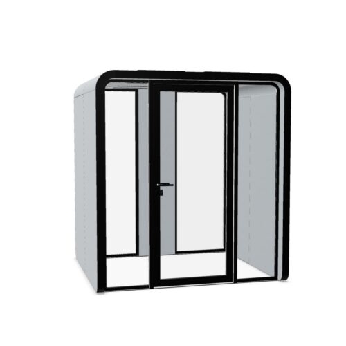
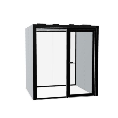
Gold Office Pods With Measured Visual Emphasis

Gold office pods may suit workplaces seeking a warm visual accent for enclosed work areas, particularly where the surrounding interior uses restrained colors. The effect depends on both the gold tone and the finish: a muted appearance can sit quietly beside warm neutrals, while a more reflective surface may attract attention from several viewpoints. Gold describes the color here; it should not be taken as a statement about the pod’s material or surface treatment. Against matte neutral finishes, gold office pods can mark a contained work area without dominating adjacent desks.

When assessing gold office pods, consider how the enclosure will look throughout the working day and from the main arrival route. Nearby lighting, pale walls and darker finishes can all influence its visual prominence. Decide where the accent belongs, then check circulation and the practical requirements of the intended work. In shared and client-facing spaces, the aim is a coherent relationship between the enclosure, its entrance and the rest of the office.

2 models
From €122.72 p/m
3 models
From €84.77 p/m

Compare gold tone and sheen separately

A color decision should distinguish yellow-leaning gold, paler champagne tones and deeper amber shades. Each relates differently to neighboring finishes. Sheen is a separate consideration: do not assume that every gold-colored enclosure has a reflective appearance. Where the proposed finish does reflect light, inspect it from seated and standing viewpoints under the lighting used in that location. Look for distracting highlights and changes in apparent color across the visible surfaces. A finish that appears restrained in indirect light may become much more prominent near a bright fitting or a window at another point in the day.

Coordinate gold office pods with existing accents

Review other gold-toned details within the same view before deciding whether to match or contrast them. Small differences between a yellow gold and a pinker warm finish can become conspicuous when they sit close together. Dark blue or charcoal surroundings can create strong definition, while cream and warm beige offer a closer tonal relationship. Wood-colored finishes also vary, so compare their undertones instead of treating them as a single neutral category. Keep enough visual separation for the pod entrance to remain understandable. Repeating gold sparingly elsewhere can connect the enclosure with the room without making every detail compete for attention.

Verify daily use and finish care

Ask for care instructions specific to the proposed finish rather than assuming that all gold-colored surfaces behave alike. Check which cleaning methods are permitted and how frequently touched areas should be maintained. Then assess the model against the intended activities: review access, door operation, ventilation, lighting and any required electrical provision. Confirm what is included. For calls or sensitive discussions, examine relevant acoustic documentation rather than drawing conclusions from the enclosure's appearance. Review installation access and any ongoing servicing requirements at the planned location. These checks establish practical suitability before the color decision becomes the main focus.

Plan the view from reception and shared areas

Gold office pods can become visually prominent in visitor spaces, so assess the full arrival sequence. From the entrance, can someone distinguish reception, the pod and the route onward? Place the enclosure where its visual emphasis supports that sequence. Avoid positioning a reflective face where changing highlights distract people at nearby desks or appear behind a frequently used video-call position. Check circulation around the enclosure, including where someone waits before entry. If transparent sections are part of the model, consider views toward occupants separately. An eye-catching exterior should still allow the workspace to function comfortably within a shared environment.

Questions about gold finishes for office enclosures

Does gold imply a shiny or metallic surface?

No. The color description alone does not establish sheen, material or surface treatment. Confirm the particular finish and assess its appearance under the intended lighting. Treat any reflection, texture or care requirement as something to verify for the model being considered.

Should the pod match nearby gold-toned details?

A close match can create continuity, but a deliberate difference can also work. Compare the finishes together rather than relying on their names. Pay attention to undertone and sheen, especially where the enclosure and smaller details will be seen in the same view.

Can a gold enclosure work away from reception?

Yes, provided its visual emphasis suits the surrounding work area. Check views from nearby desks, the visibility of the entrance and any reflections under normal lighting. Choose the location around access and intended use, then decide how much prominence the gold should have.

Explore related selections