

Pink Office Pods in Everyday Workspaces

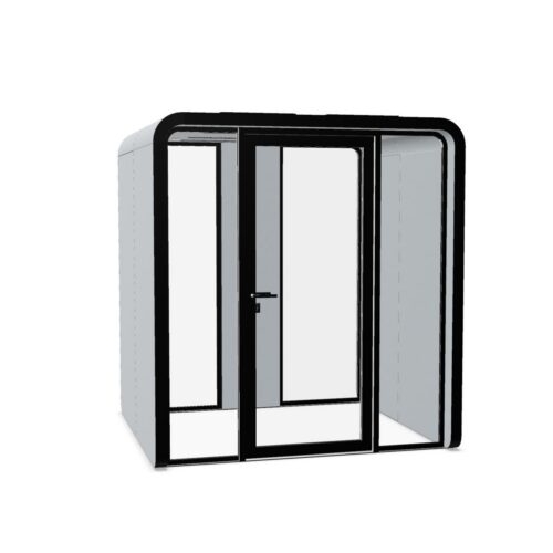
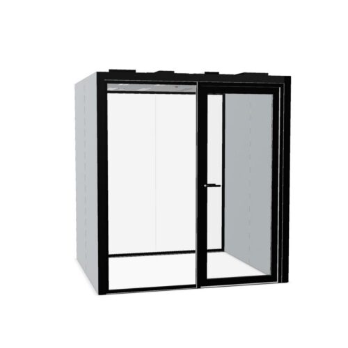
Pink office pods may suit offices introducing color into enclosed work areas while keeping the overall scheme relatively light. Blush, dusty rose and more saturated pinks have different visual effects, so the color name alone is not enough to guide a decision. A pale pink may sit close to warm beige; a stronger shade can become a clear focal point. Start by deciding how noticeable the enclosure should be from desks, shared routes and visitor seating. A measured use of pink office pods can soften a shared zone while keeping its enclosed purpose easy to recognize.

Consider pink office pods as everyday workplace settings with a defined practical purpose. Their color does not determine who should use them or which tasks they support. Coordinate the shade with existing finishes, then check the proposed location and model against actual working needs. Particular care is useful where pink sits beside white, tan or gray surfaces, because those surroundings can emphasize an undertone that was less apparent when the color was viewed separately.

5 models
From €238.03 p/m
2 models
From €242.11 p/m
7 models
From €45.33 p/m
4 models
From €28.64 p/m

Make the enclosure's purpose clear to everyone

A pink finish can give an enclosed workspace a recognizable identity, but its role should be explained in the same practical terms as other work settings. Use clear naming and consistent instructions so staff understand when and how to use it. Avoid relying on assumptions about the people or activities associated with the color. In a client-facing area, review whether the enclosure looks connected to the wider workplace and whether its entrance is obvious. A pale blush may need stronger visual differentiation from nearby walls, while a saturated pink may already appear prominent from most viewing directions.

Place pink office pods within everyday routes

Choose a location that people can reach without crossing closely behind occupied desks. Check where someone might pause before entering and whether that pause would obstruct a shared route. An enclosure near informal seating may be convenient, but nearby conversation and movement should be considered against the intended use. Keep the entrance distinct from adjoining doors or partitions, especially in a pale interior. If the model has transparent areas, assess views toward occupants and screens from the approach. The exterior shade cannot substitute for checking either visual privacy or the model's documented suitability for the work planned inside.

Distinguish blush, rose and brighter pink

Compare the pink with the largest surrounding surfaces before adding smaller accents. Peach-leaning blush can relate to warm off-whites and tan tones, whereas a cooler rose may sit more closely with blue-gray finishes. Beside yellow-toned beige, some cooler pinks can look more pronounced than expected. A stronger pink can work with a restrained background, but repeating equally saturated accents throughout the immediate area may make the pod compete with its surroundings. Look at flooring, walls and nearby upholstery together under normal office lighting. Choose deliberate contrast or clear coordination instead of an uncertain near match.

Assess the experience beyond the exterior color

Write down what users need to do inside, then review the relevant model information. Check access, door operation and the arrangements for ventilation and lighting. Confirm any electrical provision, seating or work surfaces rather than assuming these are part of the enclosure. Where calls are planned, assess acoustic evidence and consider the backdrop visible to remote participants if the model allows an interior view. Establish how cleaning will be handled and ask for care guidance for the specific finish. Also check that people can identify and operate the entrance comfortably under the lighting at its proposed position.

Questions about pink enclosed workspaces

How can pink office pods suit a shared professional setting?

Connect the shade to the wider interior and give the enclosure a clear work-related purpose. Consistent naming, access arrangements and surrounding finishes matter more than assigning personality traits to the color. Review the result from both staff and visitor viewpoints before settling on the location.

Will blush coordinate with an existing beige scheme?

Sometimes, but compare their undertones directly. A warm blush may sit close to beige, while a blue-leaning pink can create a more evident contrast. Check that the entrance remains distinguishable if the enclosure and surrounding surfaces are similar in lightness.

Does a lighter pink make an enclosure feel smaller?

Color affects visual prominence rather than the space the enclosure occupies. A pale shade may blend more closely with light surroundings, but circulation, access and installation still require their own assessment. Review the layout independently of how visually quiet the finish appears.

Explore related selections