









Give Orange a Defined Role in the Office
Decide whether the enclosure will act as a destination, mark a change in work setting or continue an established interior color. Each role suggests a different level of visual emphasis. A saturated orange may be prominent across a shared floor, while a muted shade may relate more closely to warm architectural finishes.
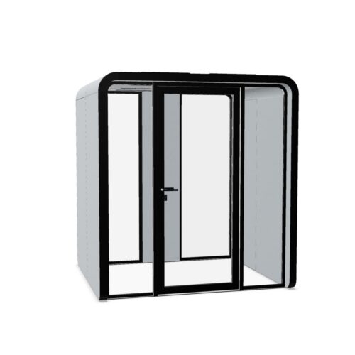
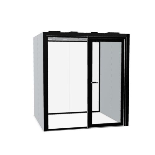
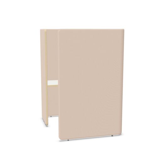
Use orange office pods selectively within the wider visual hierarchy. If reception signs, emergency information and departmental graphics already compete for attention, another strong color element needs careful placement. Evaluate the enclosure from the main arrival route and decide which information people should notice first as they enter the space.
Position Orange Office Pods at Useful Transitions
A visible enclosure can help people recognize a work setting, but its entrance still needs a sensible relationship to movement. Consider positions near a transition between shared desks and more enclosed areas, provided access remains straightforward. Avoid using a strong color to draw people toward an entrance that is difficult to approach.
Trace everyday routes past the proposed location, including movement toward shared facilities. Check where people might wait, turn or stop to speak. Allow for the selected model's door operation and access requirements, keeping those activities clear of the main route. Color can support recognition, but it cannot resolve an awkward circulation plan.
