

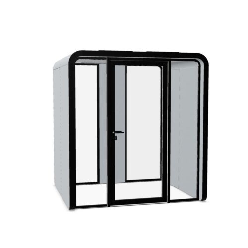
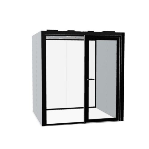
Purple Office Pods With a Defined Identity

Purple office pods may suit workplaces seeking a defined color identity for enclosed work areas without relying on a conventional neutral. Purple covers a broad visual territory: pale lavender can sit close to gray, while violet and deep plum create more pronounced color relationships. The important choice is how that shade connects with the office around it. Assess the enclosure as part of a complete room, including the views that staff and visitors encounter most often. In a restrained palette, purple office pods can mark a meeting destination without requiring the rest of the room to repeat the hue.

Comparing purple office pods requires particular attention to undertones and lighting. A red-leaning purple can relate to burgundy accents, while a blue-leaning shade may work more closely with cool grays. Neither color direction determines how well a pod supports work. Establish the intended activities, identify a practical position and review model-specific requirements alongside the visual decisions. The result should be an enclosed workspace whose purpose and entrance remain clear within the wider workplace.

2 models
From €122.72 p/m
3 models
From €84.77 p/m
2 models
From €75.40 p/m
3 models
From €42.72 p/m
5 models
From €238.03 p/m
2 models
From €242.11 p/m
8 models
From €37.23 p/m
7 models
From €19.33 p/m
3 models
From €69.67 p/m
7 models
From €45.33 p/m
7 models
From €29.79 p/m
2 models
From €50.08 p/m
2 models
From €47.54 p/m
4 models
From €28.64 p/m

Read purple under the office lighting

Inspect the proposed shade in the lighting conditions where the enclosure will stand. Purple can appear noticeably different beside warm and cool neighboring finishes, so an isolated color reference gives an incomplete picture. Deep plum may read as a dark neutral from a distance, while a brighter violet can retain a stronger identity. Pale lavender can lose definition against some light gray walls. Review daytime and evening conditions where both are relevant. Also look at the enclosure from the main approach, since the visible balance of colored surfaces and any model-dependent transparent areas can change with the viewing angle.

Build a palette around purple office pods

Choose a limited set of neighboring colors with a clear relationship to the purple. Warm off-white can soften the contrast around a plum shade, while charcoal can create a deeper overall composition. Blue-gray surroundings may connect more closely with a cooler violet. If green accents are already present, compare their intensity rather than assuming that any green and purple combination will work. Repeated purple accents need not be exact matches, but differences should look intentional. Avoid placing several almost-matching purples together unless their variation forms a deliberate part of the interior scheme.

Resolve practical suitability before the final shade

Prepare a short brief describing the activities expected inside and the relationship to neighboring teams. Check the model's access arrangements, door movement and installation requirements against the proposed position. Review ventilation, lighting and any electrical or work-surface provisions without assuming these are included. For conversations that need discretion, examine the relevant acoustic documentation. Consider sightlines as a separate issue, including views through any transparent sections and the direction of screens. Finally, establish how people will locate an available pod, report problems and arrange routine cleaning. A distinctive exterior still needs straightforward everyday operation.

Give the color a useful workplace role

Purple office pods can identify a recognizable setting within a shared office, particularly when their purpose is explained through consistent naming. Avoid implying that the hue itself makes an enclosure suitable for creative work, focused tasks or private discussions. Those uses depend on the model and workplace arrangements. In visitor areas, decide whether the pod should become part of the organization's visible identity or remain a secondary element. Place its entrance where visitors can understand the approach without guidance through desk areas. Preserve straightforward circulation around the enclosure and avoid using a distinctive color to compensate for an awkward location.

Questions about using purple in pod planning

Could a pale lavender finish disappear against gray walls?

It may offer little contrast if the colors are close in lightness and undertone. Compare them together from the approach route. If the enclosure is intended to be easy to identify, use clear entrance identification and consider a more differentiated surrounding background.

Should purple identify a particular team?

It can support that arrangement if the workplace already uses color to distinguish teams. Consider whether the enclosure will also serve other staff. A department association should not make a shared resource appear unavailable to people who are entitled to use it.

What deserves attention in a client-facing position?

Review the purple alongside reception finishes, signs and visitor seating from the arrival route. Keep the entrance understandable and consider views toward occupants. The shade can contribute to a coherent identity, but privacy and practical suitability require separate checks for the chosen model.

Explore related selections