



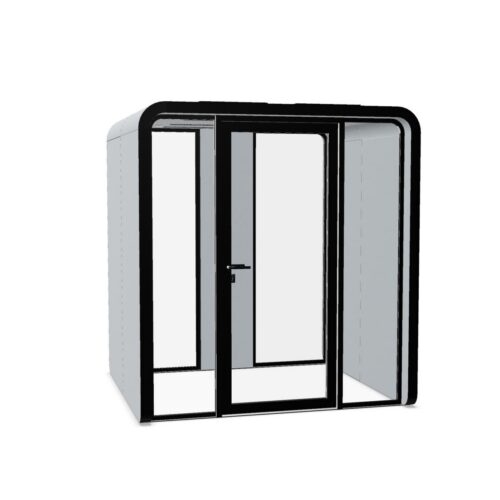
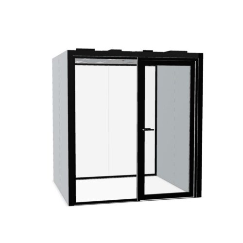


Silver Office Pods: Judge Sheen Alongside Color
The word silver can suggest a consistent appearance, yet the degree of sheen can change its visual presence considerably. A subdued finish may sit quietly beside neutral partitions, while a more reflective appearance may draw attention to surrounding light and movement. Confirm the actual surface treatment before deciding how prominent it should be.
Compare silver office pods against the finishes already repeated across the office. Silver-colored handles, lighting details and partition frames do not need to match exactly, but they should form an intentional relationship. Check whether nearby silver tones appear cooler, darker or brighter when seen together under the same lighting conditions.
Review the View From Reception and Meeting Areas
In client-facing spaces, a silver enclosure can become part of the visual language visitors use to understand the office. Decide whether it belongs with formal meeting areas, shared work settings or a transition between them. Its location should communicate a clear destination without competing with reception signs or room identifiers.
Assess silver office pods from several everyday viewpoints, including seated positions nearby. A surface that seems restrained on approach may look more conspicuous when it catches light behind a conversation area. Where a model includes glazing, consider views through it separately; exterior color does not establish visual privacy for people inside.
