


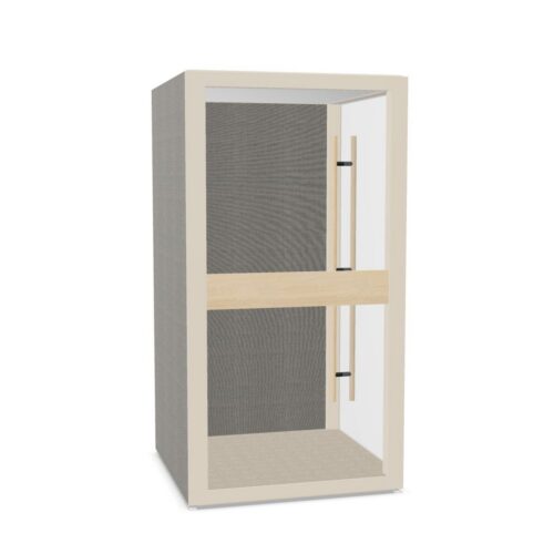
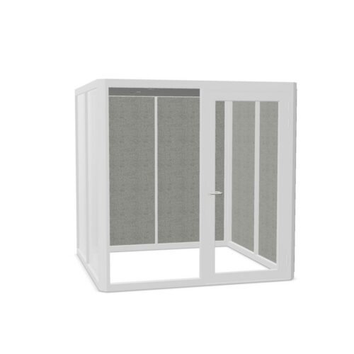


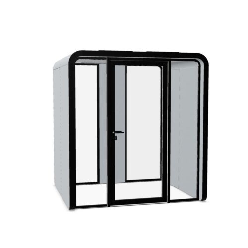
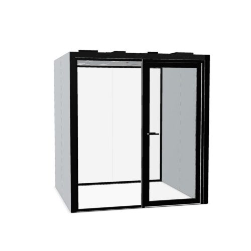


White Office Pods and Subtle Interior Contrast
White is rarely a single visual reference across an office. Wall paint, ceiling finishes and storage fronts may each carry different warm or cool undertones. Place finish samples together in the intended setting, where available, and decide whether the enclosure should closely relate to those surfaces or read as a separate element.
When comparing white office pods, pay attention to the boundary between the enclosure and its background. A small tonal difference can appear accidental when two surfaces almost match. A deliberate relationship with flooring, adjacent joinery or a darker entrance detail, where available, can make the composition easier to read.
Assess Daylight Across the Whole Enclosure
A white surface can look quite different beside a window, beneath overhead lighting or in a shaded corner. Examine the proposed position at different times, especially where bright light falls across a broad exterior panel. Surface sheen may affect reflected light, so confirm the actual finish rather than judging color alone.
Also consider people working nearby. A pale enclosure within their regular field of view should sit comfortably alongside screens and other illuminated surfaces. Exterior color does not establish the lighting conditions inside a pod; check any model-specific lighting arrangements separately against the tasks people expect to carry out there.
