



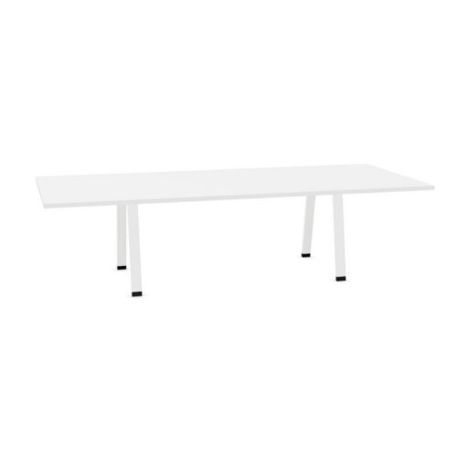


Placing Conference Tables With Beige Surfaces
Use the room's largest existing color areas as your starting point. Flooring and walls surround the table from different angles, so assess beige against both. Similar tones can create a closely coordinated composition; a clearer difference can help define the tabletop within the room. Neither approach requires every element to share the same color.
Give particular attention to adjacent neutrals. A wall described as white or a chair described as gray may have a different color character from the beige surface. Consider these relationships together, including the doorway view and the seated perspective, before settling on the overall palette.
Use Seating to Define the Table
Chairs form the immediate visual border around a conference surface. If their color is close to the beige, check whether the arrangement has the degree of distinction you want. Darker or more contrasting seating can make that border more apparent, while similar colors can make the meeting area feel more visually continuous.
Coordinate this decision with chair placement. Keep seats aligned with the positions people will actually use, and preserve routes behind them. A carefully matched palette will not compensate for an awkward approach to a chair or a circulation route that passes through the main presentation sightline.
