

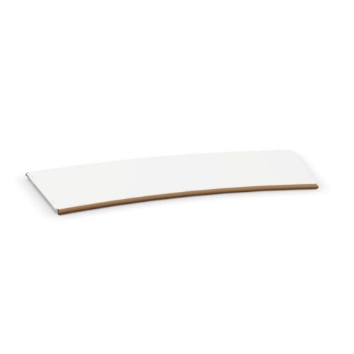
Rectangular Tops With Gold Surfaces

lounge furniture with rectangular tops and gold surfaces combines a directional tabletop outline with a distinct surface color. In a workplace lounge, this makes visual hierarchy a useful starting point: decide whether the gold surface should be a main focus or part of a wider color scheme. Then relate the rectangle to the principal seating line and the views into the room.

The combination works best as a considered part of the complete arrangement. Compare the gold color against nearby wall, floor and seating colors, without assuming a particular material or reflective finish. At the same time, assess where the rectangular edges and corners sit within the room plan. Keeping color and orientation connected helps establish a clear reason for the furniture’s placement, whether the lounge is viewed from an arrival area or from the seats arranged around the top.


Composing lounge furniture with rectangular tops and gold surfaces

Begin by identifying the main focus of the lounge. It may already be established by the entrance view, a wall treatment or the arrangement of the seats. Decide how the gold surface should relate to that focus before positioning the rectangle. If the tabletop is intended to draw attention, assess it from the main approach. If another element should remain dominant, review whether the surface color supports that hierarchy. This turns a broad preference for gold into a specific design decision tied to the room and the people using it.

Give the Rectangle a Clear Direction

Use the main seating line as an initial orientation reference, then compare it with the room's other strong lines. A rectangular top can follow one direction while the surrounding interior follows another, but that relationship should be deliberate. Check the ends as carefully as the longer sides. Seats placed near an end will relate differently to the surface from seats facing its side. Include the corners in the circulation review and keep passing routes separate from the seating group. The color should not distract from resolving these practical relationships on the plan.

Coordinate Gold Without Assuming a Finish

When assessing lounge furniture with rectangular tops and gold surfaces, treat gold as the selected color. It does not identify a metal, coating, sheen or reflective quality. Compare the actual appearance against the palette intended for the lounge under the lighting used there. Decide whether gold should recur elsewhere or remain concentrated in this surface. Repetition can be subtle and does not need to involve matching every visible detail. If other gold-colored elements are present, assess them together rather than assuming that a shared color name guarantees the same visual relationship.

Review the Surface in Everyday Use

Include any planned reading material, decorative objects or shared items in the visual assessment. Their placement can interrupt the gold color or introduce a separate emphasis along the rectangle. Decide whether the surface should remain largely visible or carry a defined arrangement of objects. Then check the composition from the entrance and from the seats at both ends. Use the same intended objects when comparing alternatives so the assessment remains consistent. Record the preferred orientation and color relationship in the room plan, giving the project team clear criteria for evaluating the complete setting.

A careful comparison starts with the upholstery as it appears across the whole seating form, then considers the legs in relation to the floor and nearby pieces. These details meet at different levels of the room, so judge them both together and separately. Note which side of the furniture faces the entrance, how seats relate to one another, and where people move through the lounge. This makes the material and color pairing relevant to the planned layout rather than an isolated finish choice.

Frequently Asked Questions

Does gold describe a metallic material?

No. Gold is the selected surface color. Material and finish details require separate confirmation and should not be inferred from the color description.

Should other gold elements match exactly?

Assess their actual appearance together. Decide whether the room needs a close visual relationship or a deliberate difference, rather than relying on the shared color name.

What should take priority during comparison?

Compare lounge furniture with rectangular tops and gold surfaces through its place in the room's visual hierarchy and its alignment with the seats. Review corner positions and surrounding routes alongside the color decision.

Explore related selections