

Lounge Furniture With Steel Bases and Blue Surfaces

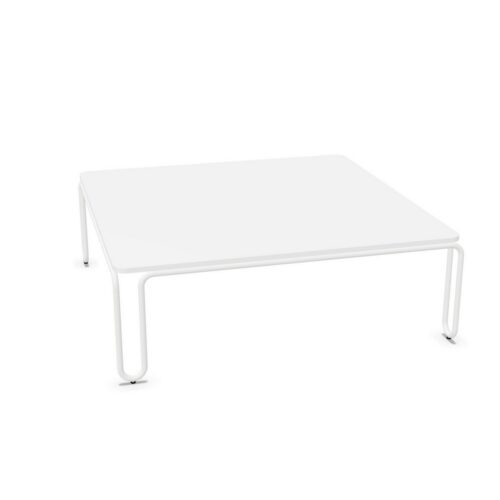
lounge furniture with steel bases and blue surfaces gives a reception or informal meeting area a defined color reference. The practical question is whether blue should identify the lounge itself or connect it with colors used elsewhere in the interior. That decision depends on the particular shade, the amount of visible blue, and the furniture’s position. Steel establishes the base material, while the base’s appearance remains a separate part of the comparison.

Begin with the routes through the space and the views between adjoining areas. A blue seating group may form a recognizable destination when viewed from reception, or it may continue a color already present in nearby rooms. Compare those relationships before repeating blue more widely. Then assess how the surface color and base work together within the furniture outline, keeping the intended role of the lounge at the center of the planning process.

10 models
From €16.65 p/m
3 models
From €125.11 p/m
2 models
From €9.47 p/m
2 models
From €9.33 p/m
€19.45 p/m
2 models
From €19.09 p/m
€13.37 p/m
€31.06 p/m
€46.12 p/m
10 models
From €45.92 p/m
5 models
From €57.57 p/m
2 models
From €58.41 p/m
10 models
From €6.68 p/m
3 models
From €9.37 p/m
2 models
From €1.68 p/m
3 models
From €9.37 p/m
2 models
From €7.03 p/m
€19.70 p/m
€23.45 p/m
29 models
From €6.19 p/m

Locating lounge furniture with steel bases and blue surfaces

Consider the blue surfaces as part of the room's visual organization. Identify where people first see the lounge and whether it should be immediately recognizable from that point. A group positioned at the end of a sightline will have a different presence from one seen briefly beside a circulation route. Review the amount of blue visible in each case. Decide whether the furniture should establish a distinct destination or participate in a broader sequence of related spaces. This gives the surface color a spatial purpose and helps guide the orientation of the seating group.

Connect blue across shared sightlines

Review other blue elements that can be seen from the lounge. Compare the actual shades rather than assuming a match from the color name. A lighter blue and a deeper blue can create a deliberate relationship, but their distribution should be considered together. Identify which element is intended to lead the composition and which should reinforce it. Where the lounge is visible from several rooms, prioritize the strongest visual connections. Repeating blue in every neighboring area is not necessary if the main sightlines already establish a clear relationship between the settings.

Compare the color with the steel base

The appearance of lounge furniture with steel bases and blue surfaces depends on more than the blue alone. Examine how the actual base relates to the surface and to surrounding furniture. Steel identifies material without establishing its color, finish, or frame arrangement. Look for the degree of visual separation between the components and consider whether that separation suits the room. A prominent base creates another feature within the composition, while a less distinct base may leave the blue surface as the stronger element. Review both distant and nearby viewpoints before deciding which relationship is appropriate.

Let the layout express the intended activity

For informal meetings, arrange the furniture so the direction of conversation is apparent and the entrance into the group is easy to identify. For waiting areas, consider how the group faces reception and how people rejoin the main route. Blue can help establish a visual identity, but it does not determine the activity or the furniture's suitability for it. Assess the actual form separately. Review the completed arrangement from the adjoining spaces to confirm that color, orientation, and placement communicate the same purpose. A coherent group should relate to its setting while remaining clear as a place within it.

Frequently asked questions

Should the blue match colors used in neighboring rooms?

A direct match can create continuity, but related shades can also work when their relationship is deliberate. Compare the elements along shared sightlines and decide which blue should be the principal reference within the overall composition.

Can the same blue direction serve waiting and meeting areas?

It can provide visual continuity between them. Their arrangements should still reflect different activities. Assess furniture orientation, the route into each group, and the relationship with reception or adjoining rooms independently of the shared color.

What helps distinguish a blue lounge as a destination?

With lounge furniture with steel bases and blue surfaces, consider visibility from the main approach, the concentration of blue, and the group's orientation. Assess base appearance too, so the complete furniture outline supports the intended visual emphasis.

Explore related selections