

Blue Surfaces for Lounge Furniture

Blue surfaces for lounge furniture can establish a recognizable color reference across reception seating, informal meeting areas, and shared lounges. The planning task is to decide whether blue marks a particular destination or connects several related spaces. Start with the routes people follow through the workplace and the views available along them. A blue seating area seen from a corridor has a different role from one encountered only after entering a separate room.

Compare blue surfaces for lounge furniture by their tonal depth, undertone, and visible extent. A pale blue and a deep blue create different relationships with the same background, while blue that leans green may sit differently beside existing colors than blue that leans purple. Establish the intended role first, then review the color within the complete arrangement. This helps keep decisions about individual pieces aligned with the wider organization of the workplace.

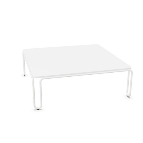
10 models
From €16.65 p/m
3 models
From €125.11 p/m
2 models
From €9.47 p/m
2 models
From €9.33 p/m
€19.45 p/m
2 models
From €25.77 p/m
2 models
From €38.54 p/m
2 models
From €12.40 p/m
2 models
From €19.27 p/m
€31.06 p/m
€46.12 p/m
€21.83 p/m

Locating blue surfaces for lounge furniture

Trace the main journey from arrival to the lounge and note where the seating first becomes visible. If blue is intended to identify that destination, its placement should make sense from those approach points. Review the view through openings, across reception, and from intersecting circulation routes. A color reference that is clear inside the lounge may be hidden from the route leading to it. Adjust the furniture orientation where appropriate, then assess the result at eye level. Keep the color's role specific so that its use elsewhere does not make the intended destination harder to distinguish.

Choose a consistent blue relationship

When comparing blue surfaces for lounge furniture, identify the undertone that relates best to the room's permanent colors. Place references together rather than reviewing each in isolation. Where blue already appears in the interior, decide whether the seating should repeat it closely or introduce a deliberate tonal variation. Be especially attentive when different blues share a single view. A near match can appear less intentional than a clear difference. Agree on the relationship the team is seeking and use that agreement to assess the complete seating composition before introducing additional colors around it.

Control repetition along shared routes

Repeated blue surfaces for lounge furniture can give related areas a common visual reference. Decide which destinations should share that reference and why. A reception lounge and a nearby informal meeting area may need a connection, while a separate space may benefit from its own identity. Consider the sequence of views as people move between them. Repetition is most useful when it communicates a coherent relationship across those views. Review the amount of blue visible at each point, including furniture backs, so that the color does not become unexpectedly concentrated where several seating areas appear together.

Compare tonal depth with the background

Assess blue surfaces for lounge furniture against the intended floor and walls under normal occupancy lighting. Deep blue may create a strong outline against a pale background, while a lighter blue may form a subtler relationship. Neither approach determines the layout by itself. Check that the seating zone remains legible and that its relationship with adjacent circulation is clear. If the lounge includes several visual focal points, decide which should lead the composition. Use the color review to resolve that hierarchy before smaller accents or decorative decisions add further competing points of interest around the room.

Questions about blue lounge planning

Should blue identify every shared seating area?

Use a common color where the areas have a meaningful relationship. Review whether repeating it clarifies the workplace layout or makes distinct destinations look too similar. The decision should follow the intended organization of the spaces.

How should different blues be compared?

Place blue surfaces for lounge furniture beside the existing blue references under the same light. Compare undertone and tonal depth, then decide whether a close relationship or a clearly differentiated combination best suits the room.

Which viewpoint matters most for a reception lounge?

Start with the arrival view, then check the approach to the seating and the view from within it. Each reveals a different amount of blue and helps establish whether its placement supports the intended use.

Explore related selections