



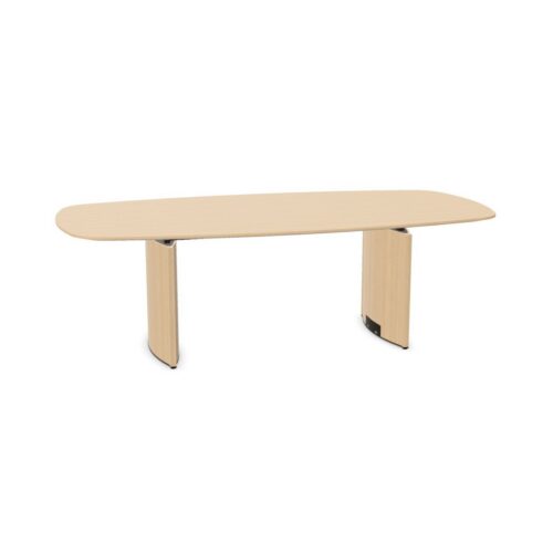


Giving Conference Tables With Gold Surfaces a Clear Role
Decide whether the table will provide the main color accent or join an existing decorative scheme. This changes how you approach nearby furniture. If the table is the intended focus, assess chairs and storage against the surface rather than selecting each piece independently. If gold already appears elsewhere, compare the colors together before treating them as a match. Similar color names can describe appearances that sit differently beside each other.
Keep the meeting task in view throughout that comparison. A room used for detailed document review may need a calmer surrounding palette than a space mainly used for informal discussion.
Checking Appearance From Every Seat
Review the proposed arrangement from the doorway, participant seats and presentation position. A surface that looks balanced on entry may relate differently to a bright window or strongly colored wall when viewed from a chair. Consider the room during the periods when meetings usually take place, including changes between daylight and artificial lighting.
For gold conference tables, assess the actual surface appearance rather than assuming that gold means shiny. Check whether nearby lighting or decorative elements compete for attention. The aim is to keep faces, documents and shared displays easy to follow while allowing the selected color to remain part of the room.
