





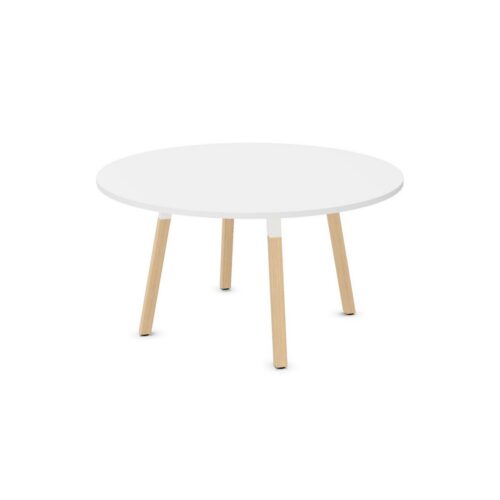
Coordinating grey surfaces for lounge furniture
Map the fixed colors before reviewing the seating. Include the floor, major walls, doors, and any nearby features that will remain visible. Place the proposed grey beside these references in the actual room where possible. Observe whether the combination appears coherent or whether one surface makes another look unexpectedly warm, cool, pale, or dark. The purpose is to establish a compatible relationship, not to make every element identical. Record which existing color acts as the main reference so that later decisions follow the same reasoning rather than introducing a different interpretation of grey.
Use tonal differences with a clear purpose
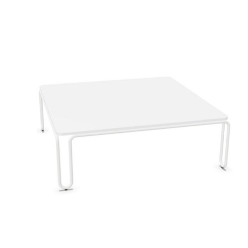
Light and dark versions of grey surfaces for lounge furniture can create different levels of separation from the background. Consider where the furniture outline needs to be evident and where a quieter transition is appropriate. In a lounge beside an open work area, a tonal change can mark the seating zone without introducing an additional color family. Review the whole composition from the main approach. Several close greys may appear deliberate when their roles are clear, but uncertain relationships are easier to notice across broad surfaces. Compare adjacent tones directly before agreeing on the overall direction.
